


So here I was in the midst of writing up a new synopsis on the national polls when I noticed something odd. The numbers for this week were strangely similar to the numbers of last week. So I dug a little deeper and made some realizations. Maybe it is just me thinking that "new numbers" were coming out each Monday in the Real Clear Politics national average. But it turns out that is not the case at all. One one poll was new, and the rest are old data. I'm a little disappointed in them for regurgitating the same numbers over and over.
The numbers shown above are the same numbers we have been seeing for a few weeks now. Go back and take a look for yourself. Particularly take a look at CNN, USA Today, and Fox. They are showing the same polls over the same exact dates for the past three weeks. But this Monday they have thrown in one new poll, mixed with the old data, to create new numbers. The polls weren't even conducted in the same time period, which really throws off the accuracy of the gauge.
So I broke down the polls and made my own chart.

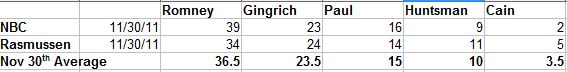
So let's move on to Iowa and New Hampshire, shall we? Last week in the Iowa polls we saw inconsistent results. Gingrich and Cain were jockeying for first place, but Romney had a strong foothold as well, with Paul holding steady. Again after reviewing the Real Clear Politics summary and chart, I'm not crazy about the way they pulled together their numbers to create the RCP Average (again, old numbers mixed with a new number), but I'll share it anyway.

You can see their "average" is pulled together from Nov 11-30. A lot of things happened during that time period, with a lot of numbers jumping up and down, so I don't feel like it is an accurate figure. I'd prefer a figure that compares polls all taken on the same day. So again, I pulled together the data and made my own table.

My average results in a different lineup, but I do feel more comfortable with it. It represents one succinct period of time, instead of over such a broad period of time where a lot things happened to change voters' opinions (Cain scandals, debates, etc.). Also, comparing the same poll taken over a month's difference really helps to show the constantly changing tides in Iowa. But it is interesting to note that my way puts Ron Paul ahead of Mitt Romney just a smidge. Gingrich has a 10 point lead over Paul, and in theory, we're going to see whatever support is behind Cain go to Gingrich this afternoon. Whether or not Cain still has 9 points worth of supporters is yet to be seen though. Like I say every week, next week's numbers should be interesting.
Now for the same in New Hampshire-

No comments:
Post a Comment
Your comments are always welcome here!